

Where Mahindra Stands Today
Some cars walk into a room and demand your attention immediately. They are loud about it. They want you to notice. The XUV 7XO is not that kind of car. It is the other kind. The kind where you spend time with it and slowly realise it is more considered than it first appeared. The confidence here is real precisely because it does not need to perform.
Mahindra has been on a long journey to arrive at this point. The ruggedness was never the question. That has always been in the DNA. The real question was whether Mahindra could take that ruggedness and shape it into something that felt intentional rather than accidental. Something that worked in a Bengaluru apartment basement as well as it did on a Rajasthan highway. For most of the brand’s history, the honest answer was no. The XUV500 showed the first real signs that the answer might change. The Scorpio N and the XUV700 confirmed it had.
The 7XO sits at the other end of that journey. On paper it is a facelift. In person it feels more settled than that. It feels like a brand that has stopped asking what its cars should look like and started refining what it already knows. That shift from searching to speaking is what makes this car worth looking at properly.
Design Language and Identity
The most important thing to understand about the 7xo before you look at any individual detail is this. Mahindra is building a design system now. Not just making cars. Building a system.
For a long time every Mahindra felt like a separate project. Strong in character, but disconnected from the others. The XUV500 had presence but stood alone. The Bolero existed in its own universe. Even the first generation Scorpio, as iconic as it became, was not the start of a family conversation. It was its own statement and nothing more.
What has changed over the last four or five years is intentional cross pollination. You can see the triangular lamp graphic on the 3xo and then see it again here on the 7xo and understand immediately that this is not a coincidence. It is a decision. The chrome detailing inside the projectors echoes the Scorpio N. The shoulder logic connects to the XUV700. These are not styling accidents. Mahindra is writing a visual grammar, and the 7xo is one of the more fluent sentences in that grammar so far.
What I find genuinely interesting about the direction is that it is identity driven rather than trend driven. This car does not look like it is chasing anyone. It does not look like it wants to be German or Korean or electric looking for no reason. It looks like Mahindra, and that is a compliment now in a way it simply was not ten years ago
Exterior
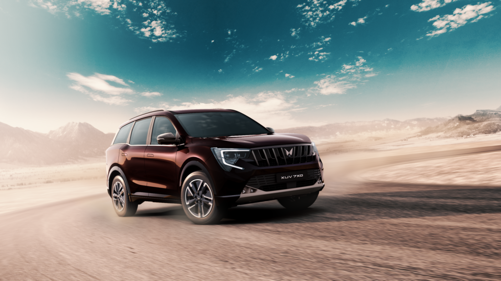
The body of this car is calm. That is the first thing to say and it is the most important thing about the exterior.
Look at the side profile and there is no drama being forced onto you. The proportions are natural. The greenhouse and the body feel balanced. The overhangs are not exaggerated for visual theatre. They are sized for purpose, and that purpose is everyday city use with the ability to handle more when asked. The form communicates this without shouting it, which takes real restraint.
The surfaces are where Mahindra has clearly invested serious thought. The transitions between panels are smooth. Nothing breaks abruptly. The light catcher line that runs through the doors is doing more work than most people will ever realise, because the flush door handles, as premium as they feel, could have left those panels looking completely flat. That line saves them. It adds depth and a subtle sense of movement that you feel even when you cannot name what you are responding to. That is exactly what a well placed surface detail should do.
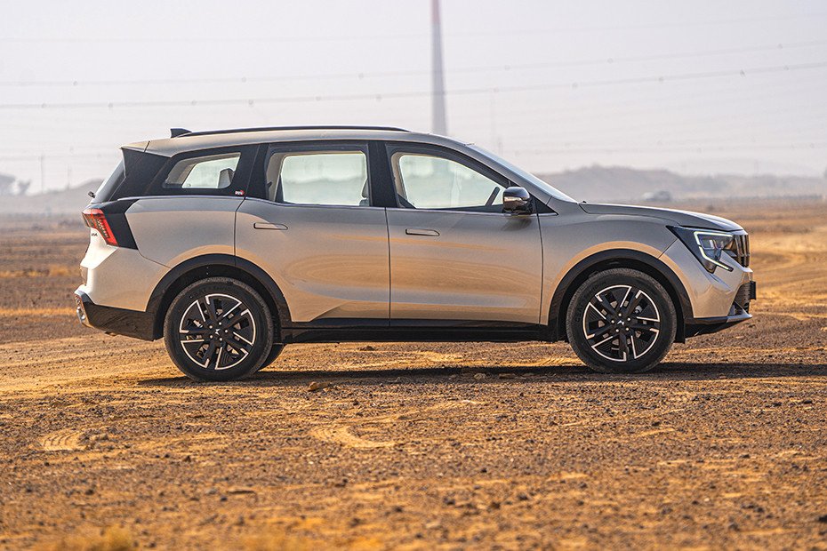
The belt line runs with intention. It adds movement to the side profile and if you follow it long enough it quietly connects into the rear bumper shut lines. That kind of continuity is not necessary for the car to function. It is done because it makes the design feel like one complete thought rather than several thoughts placed near each other. There is a difference and you feel it.
The rear roof slope is quietly solving a problem that most people would never consciously identify but would immediately feel if it were not there. Without that slope the car would look heavy and bulky at the back. The slope visually stretches the form and corrects the slight rear bias in the mass distribution. Good proportion management is mostly invisible and that is exactly how it should be.
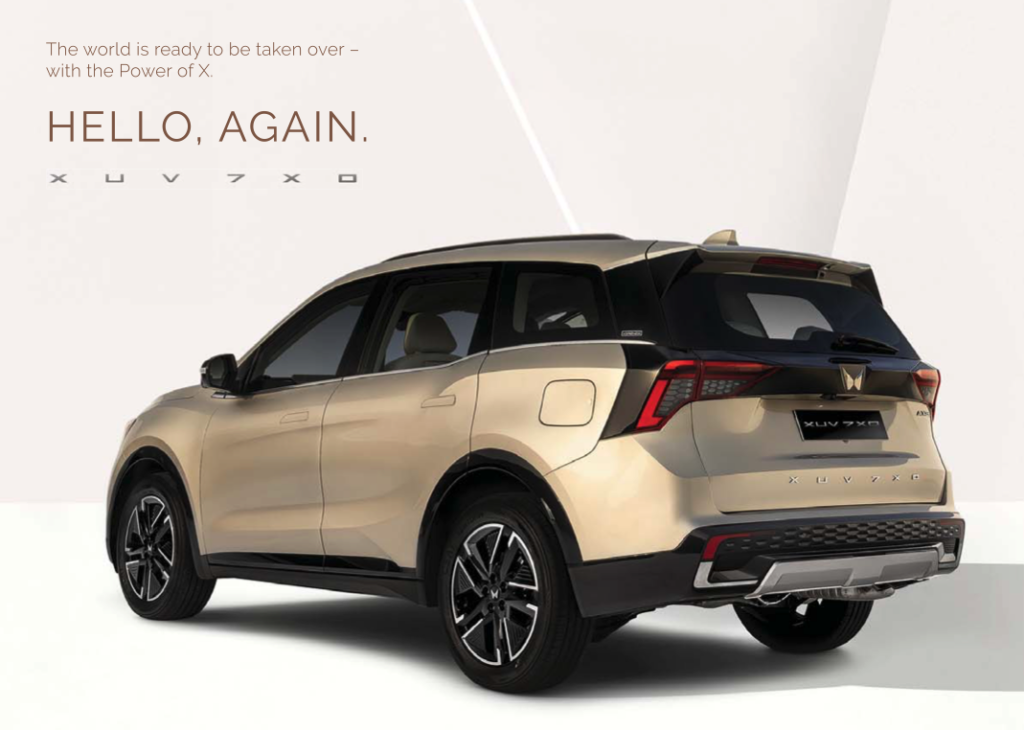
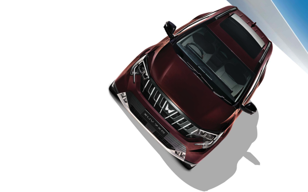
The rear is the most resolved part of this car. The tail lamp graphic has evolved from the older hammer form DRL pattern to a C shaped identity and that same C form repeats in the lower bumper. That kind of repetition sounds simple but it takes real discipline to execute well, and the discipline pays off. The rear feels like one complete thought. The XUV 7xo lettering at the boot centre is not just branding either. It anchors the width of the surface and gives the eye somewhere to rest.
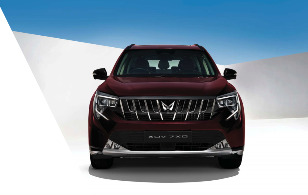
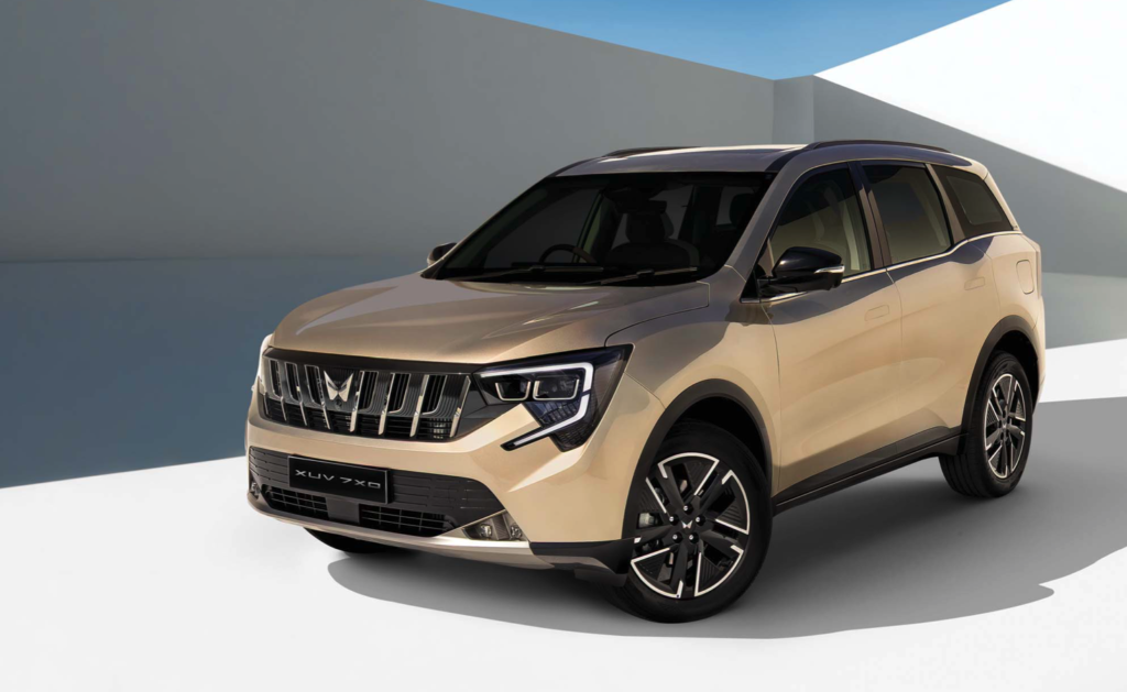
Now the front. This is where Mahindra pushed harder than the rest of the car needed.
The seven section grille adds visual weight and layers that the calm body sitting behind it does not really ask for. The headlamp silhouette connects clearly to the XUV700 family which is absolutely the right call. The triangular graphic inside the lower half of the lamp is a good detail. The chrome surrounding around the projectors has craft to it. But together, everything happening on this face creates more visual activity than the rest of the car is prepared for. The rear is resolved. The body is calm. The front is busy. That imbalance is noticeable once you spend real time with the car.
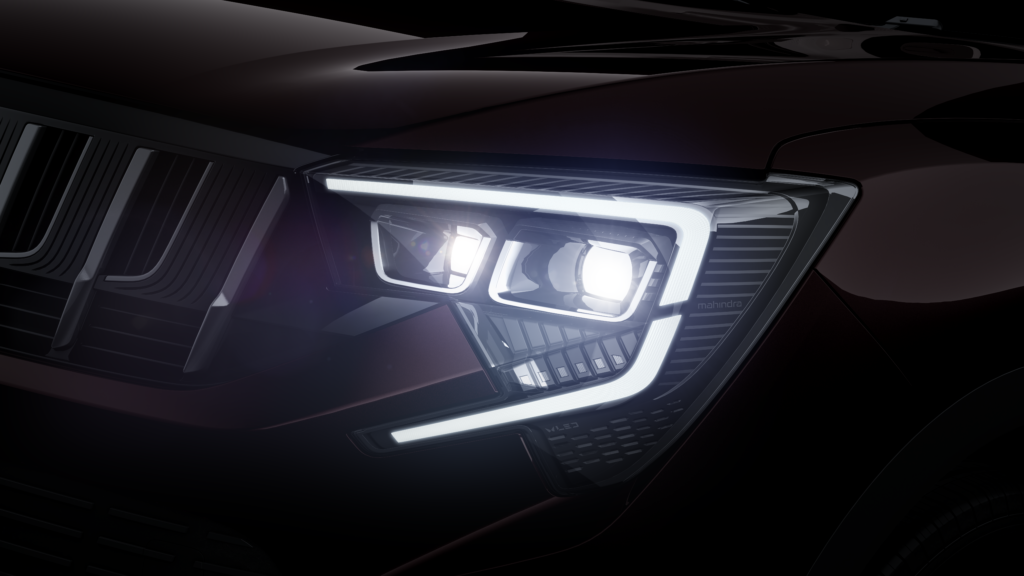
The DRL placement is a decision I find genuinely puzzling. The previous version pushed DRLs to the outer corners which made the car look wider than its actual dimensions. Here they sit further inward, and combined with the fog lamps positioned closer to the centre, the front reads slightly narrower than the car actually is. On something that is genuinely wide, optically shrinking that width feels like the wrong trade. The DRL shape at the bottom, which reads almost like sharp teeth in certain light, is actually the most charming detail on the whole front. It is playful without announcing itself. Hidden character moments like that are what give a design personality beyond the obvious.
The wheels are proportionate and they sit correctly within the arches. They relate sensibly to the body. But they are not doing anything that makes you stop. They are present without being expressive. At this price point, with this level of attention visible elsewhere on the car, the wheels feel like the one area where ambition simply ran out.
Interior Design
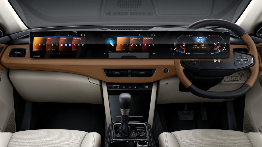
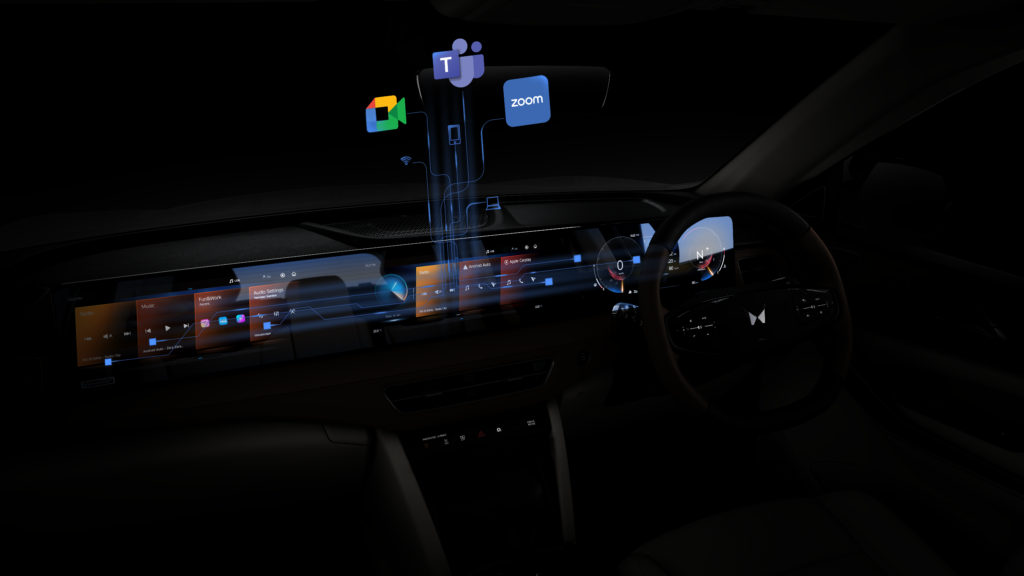
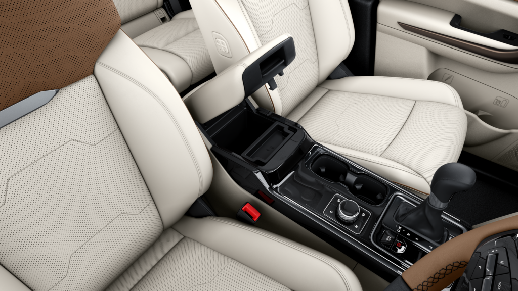
The moment you sit inside, the triple screen setup makes its statement. That statement is modern, premium, and high tech. Honestly, it lands. The cabin does feel contemporary. The new colour scheme and the increased soft touch material coverage reinforce that reading and the overall first impression is genuinely strong.
But here is the problem with building a dashboard almost entirely around screens. The screens consume so much surface area that everything around them ends up with almost nothing to do. The centre AC vents feel placed rather than designed. They sit in the dashboard without any meaningful relationship to the surfaces around them. The areas of the dashboard that are not screen feel passive, almost like placeholder panels waiting for a next generation brief to give them something to say.
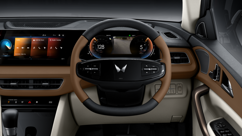
The steering wheel draws from a two spoke silhouette which is a good reference, updated with a chunky gloss centre panel. That gloss treatment continues into the AC controls below the screen. These surfaces look right at this moment. In two years they will show the scratches, the fingerprints, and the dullness that gloss surfaces always eventually reveal. That is a long term ownership experience consideration that the short term visual appeal tends to make people forget.
Where the interior genuinely works is in its material logic. Soft touch surfaces appear exactly where your hands land. Brushed metallic finishes sit where piano black would have been a nightmare to live with daily. The two tone colour usage expands the perceived space without requiring any structural change. The material zoning across the dashboard follows an ergonomic structure that gives the interior a sense of order even when it is visually busy. That is harder to achieve than it looks and it is done well here.
One observation worth making is that the lower and mid variants of this car are actually more visually interesting than the top trim in some ways. The material and colour combinations on those dashboards bring a lightness and a playfulness that the more monochromatic top variant quietly trades away in pursuit of a premium reading. Sometimes less specification produces more interesting design than more
Cabin Experience
Spend real time inside and the cabin gives you more than the dashboard alone suggests it will.
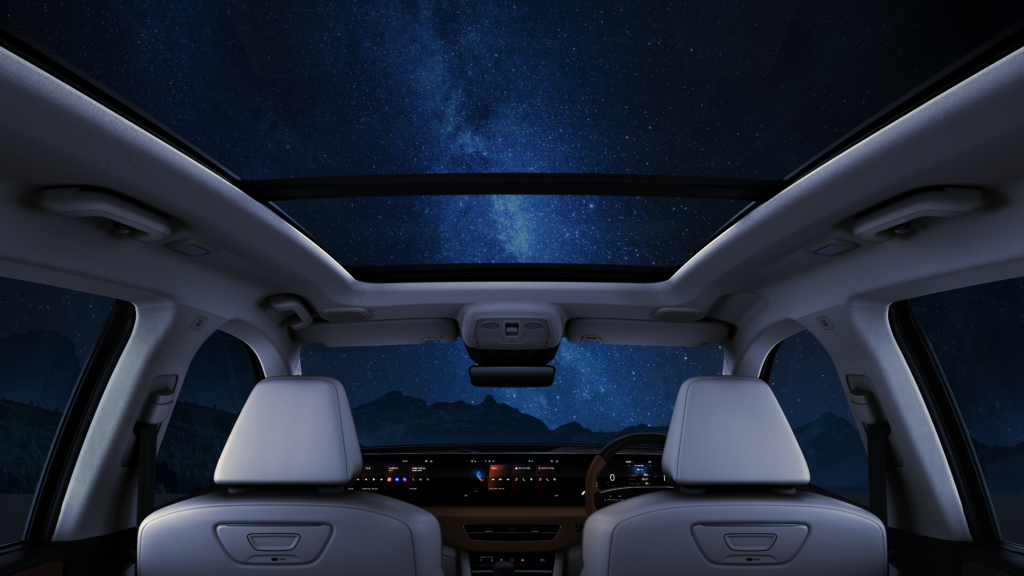
The panoramic sunroof working together with the light coloured roof lining genuinely changes the character of the space. Light enters generously, the ceiling feels higher than it physically is, and that openness works for both front and rear passengers. It is one of the better experiential decisions in this car and it adds almost no design complexity to achieve.
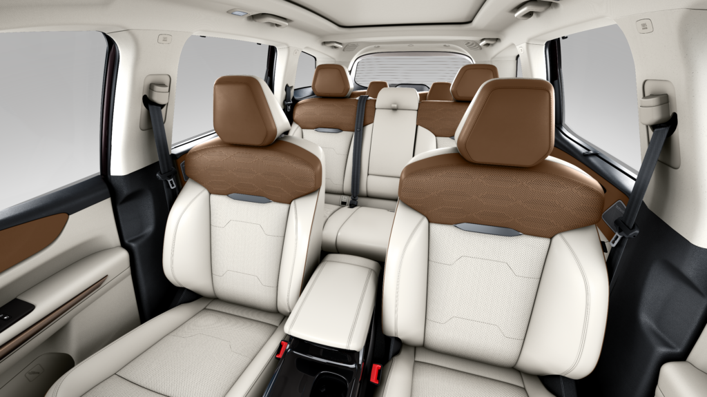
The rear seat is tuned for long distance comfort rather than sporty posture, and that is exactly the right reading of what this buyer needs. The option to connect external displays for rear passengers rather than forcing built in screens is a small decision that reflects a genuine understanding of how Indian families actually use their cars on long journeys. Nobody sitting in the rear wants to consume what the car has decided to offer. They want their own device, their own content, their own experience. Giving them a clean way to do that is better product thinking than another embedded screen.
The cabin does not have obvious moments where cost cutting becomes visible, which at this price point is a baseline expectation that not everyone in this segment consistently meets.
What I want from the next generation of this interior is more surface play in the areas that are not screen. Right now the screens carry almost all of the visual work in the front cabin. The surrounding surfaces are quiet to the point of passivity. More sculpting, more material variation in those quieter zones would give the interior a spatial richness that it currently reaches for but does not fully achieve.
Manufacturing and Design Reality
The exterior sits in a productive middle ground between ambition and what is actually achievable at volume.
The light catcher, the belt line continuity, the coherent rear lamp graphic. These are not cheap details to execute consistently across thousands of cars. The fact that they hold up suggests the manufacturing brief was taken seriously and that the design team had enough backing to see these decisions through to production. That does not always happen, especially on facelifts where budgets are tighter than on new platforms.
The lighting design is detailed without being extravagant. Mahindra has added visual complexity to the lamps without pushing into territory that would significantly raise replacement costs for owners. In a segment where a front lamp assembly can cost more than a minor collision repair, that restraint is genuinely buyer friendly even when it is not the most exciting design choice.
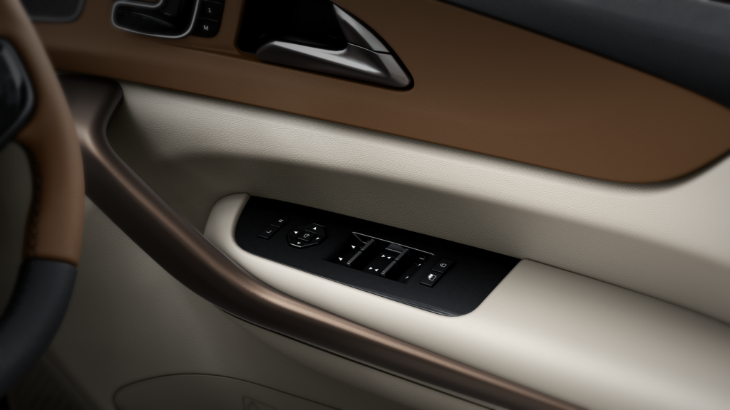
Inside, the touch based climate controls are partly a cost decision and it is worth understanding that clearly. A screen integrated climate system is often cheaper to produce and update than a purpose built physical control panel, even when the physical panel produces a better daily experience. The compromise that shows up as a usability problem in the cabin very often originates in a finance conversation, not a design conversation.
The gloss surfaces on the steering centre and climate controls will wear faster than matte or brushed alternatives. This is a known industry trade off made here in favour of the initial impression over the three year impression. Buyers who hold their cars for five or more years will feel this decision more than buyers who change every thirty months.
Design Verdict
The XUV 7xo does not ask you to be surprised by it. That is not a weakness. That is maturity.
Mahindra has reached a point in its design journey where dramatic gestures are no longer needed to prove the brand belongs. The body of this car is calm and resolved in a way that would have been genuinely difficult to picture from this manufacturer a decade ago. The rear is considered. The interior has a material logic that reflects real design thinking rather than a feature list assembled for a brochure.
The front works harder than the rest of the car needs it to. The touch climate controls create a daily friction point that clearer thinking about actual usage could have avoided. The wheels are a missed opportunity on a car that otherwise shows real design ambition. These are real criticisms and not small ones.
But look at the whole car and what you see is a brand that has found its voice and is now learning to use it with more control. The 7xo does not look like it is trying to be something it is not. It carries Mahindra’s identity with confidence rather than apology. It understands who it is made for and makes most of its decisions in that person’s interest.
Knowing who you are and knowing who you are designing for. That combination is rarer in this industry than it should be. The XUV 7xo has both. That is why it matters, not just as a product, but as a signal of where this brand is genuinely going.